Mported Flows - Three Pronged Fork

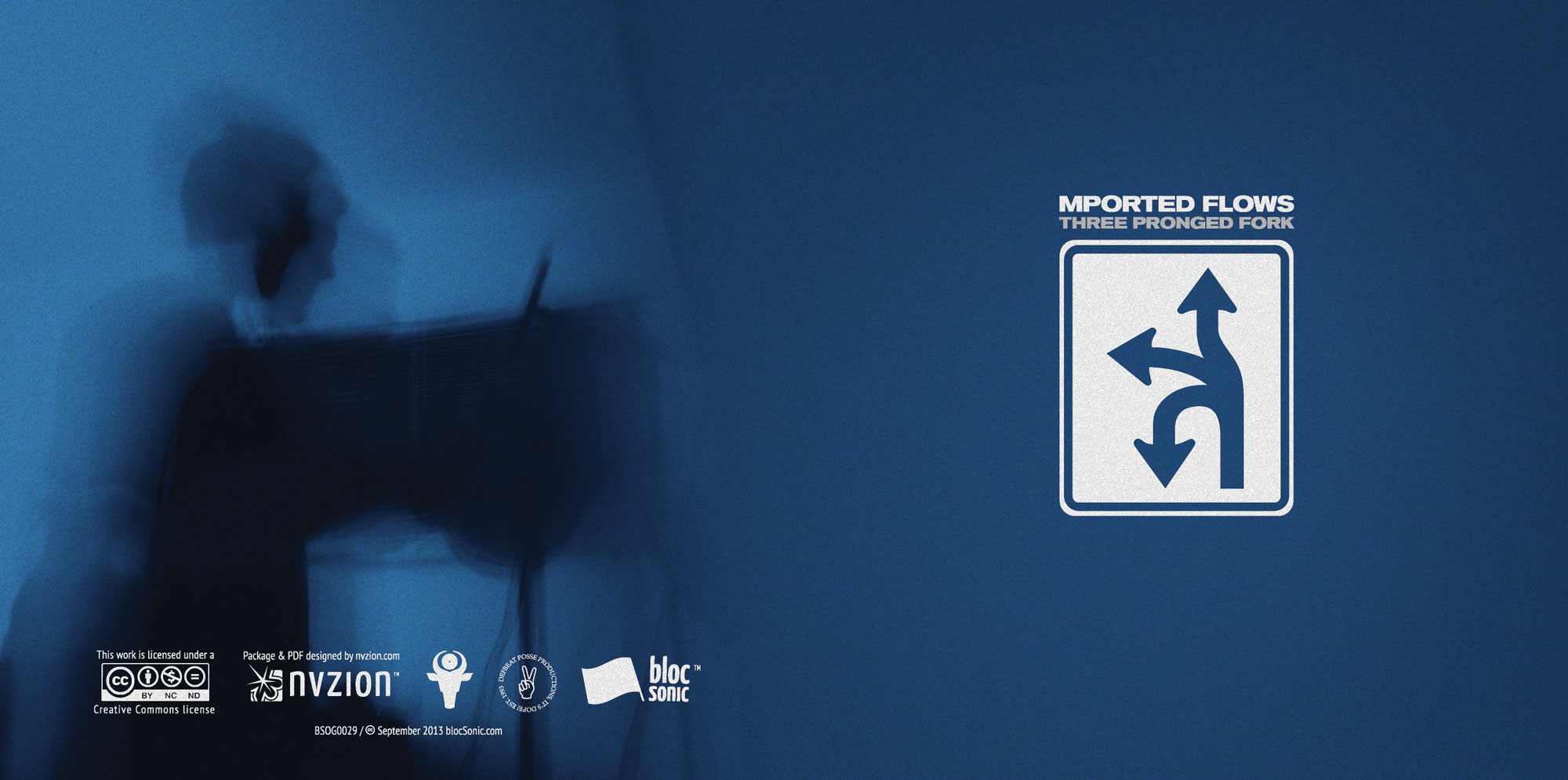
In 2013, we were brought on to design the latest DefBeat Productions release at blocSonic. The one requirement… incorporate a triple forked road sign on the cover.

Jewelcase insert design
With that information we immediately had an idea to keep the design minimal with a flat design aesthetic and lots of negative space.

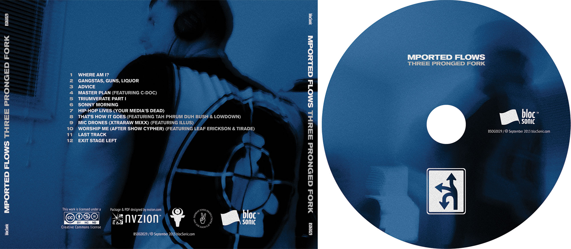
Traycard insert & CD design
After having listened to the music with its classic early 90s boom bap hip-hop style, it became clear that it would be great to steer the typography to something like an homage to classic Def Jam album art with its heavy sans-serif fonts.
